Use Toggle Button 3D to create a 3D toggle button and Toggle Button 2D to create a 2D toggle button. After you create a Toggle Button node you have to add another node to it to create a visual representation of the toggle button.
For example, to show the difference between the on and off states of a toggle button, you can:
Switch the material or color of the visual representation of the toggle button.
Attach two different visual representations of the toggle button and switch their visibility.
Attach two different visual representations of the toggle button and transition between the two by animating their Blend Intensity property value.
Creating a toggle button with two states
To create a toggle button with two states:
In the Projectpress Alt and right-click the node where you want to create a toggle button and select either Toggle Button 3D, or Toggle Button 2D. Note that you can create a 3D node only inside 3D nodes, and 2D node only inside 2D nodes.
In the Project select the Toggle Button node and in the State Tools click to create a state manager in the Toggle Button node.
In the State Tools click twice to create two states, double-click the name of each state, and rename the states. For example, name one On and the other Off. The On state defines the state of your application when the toggle button is switched on, the Off state when the toggle button is switched off.
In the Project create a visual shape to the Toggle Button node, and set its appearance for when it is in the On state. For example, if you created a 3D toggle button, add a Text Block 3D and set the Text property to On.
In the State Tools click above the On state to save the current appearance to that state.
Repeat the previous two steps to create the Off state for the toggle button.
In the State Tools click <No Controller Property> and select Button > Toggle State. In a state manager the value of the property you select as the Controller Property defines the conditions when each state in a state group is active.
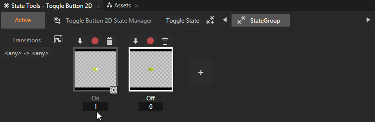
In the State Tools set the value of the controller property for each state. For the On state set the value to 1, and for the Off state leave the value set to 0.
In the State Tools click Active to deactivate the State Tools.
In the Preview when you click the visual representation of the toggle button and as the toggle state of the toggle button changes, so does the appearance of the toggle button you created.
Creating a toggle button with more than two states
To create a toggle button with more than two states:
In the Projectpress Alt and right-click the node where you want to create a toggle button and select either Toggle Button 3D, or Toggle Button 2D. Note that you can create a 3D node only inside 3D nodes, and 2D node only inside 2D nodes.
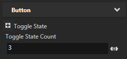
In the Project select the Toggle Button node and in the Properties add and set the Toggle State Count property to as many toggle states you want the toggle button to have. For example, to create a toggle button with three states, set the Toggle State Count property to 3.
In the Project select the Toggle Button node and in the State Tools click to create a state manager in the Toggle Button node.
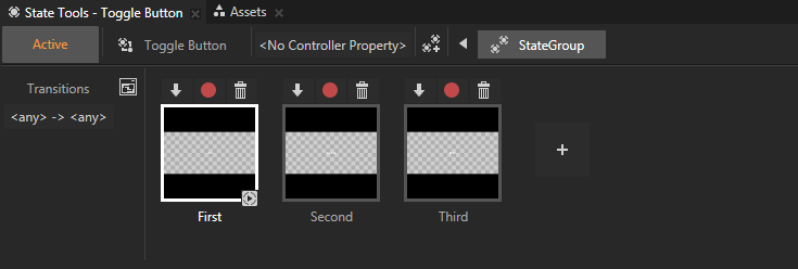
In the State Tools click as many times as you want to create states, double-click the name of each state, and rename the states. For example, if you are creating a toggle button with three states name the first state First, the second state Second, and the third state Third. Each state defines the state of your application when the toggle button is in that state.
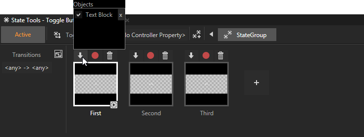
In the Project create a visual shape to the Toggle Button node, and set its appearance for when it is in the first state. For example, if you created a 3D toggle button, add a Text Block 3D and set the Text property to First.
In the State Tools click above the First state to save the current appearance to that state.
Repeat the previous two steps as many times as you have states in the toggle button. For every state set a different value for the Text property and save the value to a different state.
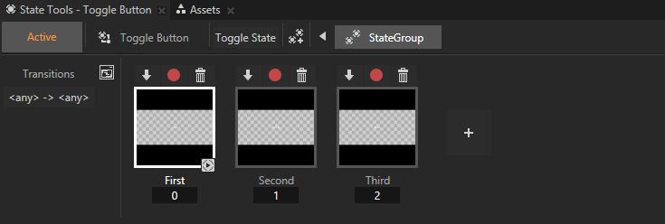
In the State Tools click <No Controller Property> and select Button > Toggle State. In a state manager the value of the property you select as the Controller Property defines the conditions when each state in a state group is active.
In the State Tools set the value of the controller property for each state. For example, for a toggle button with three states, set the value for the First state to 0, for the Second state to 1, and for the Third state to 2.
In the State Tools click Active to deactivate the State Tools.
In the Preview when you click the visual representation of the toggle button and as the toggle state of the toggle button changes, so does the appearance of the toggle button you created.
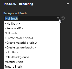
Setting the background of a Toggle Button 2D
Use brushes to set the background of 2D nodes. In Kanzi all 2D nodes by default have transparent background.
To set the background:
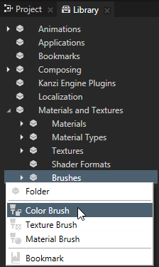
Create a Color Brush, a Texture Brush, or a Material Brush. See Using brushes.
In the Project select the 2D node the background of which you want to paint. Note that you can set only the background of 2D nodes.
In the Properties click , add the Background Brush property, and select the brush you created in the first step.
 to create a state manager in the Toggle Button node.
 twice to create two states, double-click the name of each state, and rename the states.
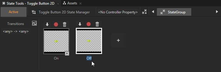
 above the On state to save the current appearance to that state.
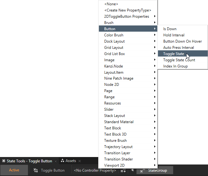
 , add the